
File Transfer Protocol, or FTP, has been around for a long time. It is simple. It is powerful. And it is still widely used to move files between systems. But when it comes to explaining where files live on an FTP server, things can get confusing fast. That is where Lucidchart helps. With the right shapes and structure, you can turn messy file paths into clean, easy-to-understand diagrams.
TLDR: To represent an FTP file location in Lucidchart, use folder-style hierarchy diagrams. Start with the server, then break it into directories and subfolders. Use clear labels, icons, and connectors to show structure and flow. Keep it simple, visual, and organized so anyone can understand the path at a glance.
Let’s break it down in a fun and simple way.
First, Understand What an FTP File Location Really Is
An FTP file location is just a path. It tells you where a file lives inside a server.
It usually looks like this:
ftp://example.com/public_html/images/logo.png
Inside that string, you have:
- The protocol: ftp://
- The server: example.com
- The root directory
- Subfolders
- The actual file
Think of it like a home address. Country. City. Street. House number.
Lucidchart helps you draw that “address” visually.
Step 1: Start With the Server
Open a new Lucidchart document. Choose a blank canvas.
Your top-level element should represent the FTP Server.
You can use:
- A rectangle
- A cloud shape
- A server icon
Label it clearly. For example:
FTP Server: example.com
This is your starting point. Everything flows from here.
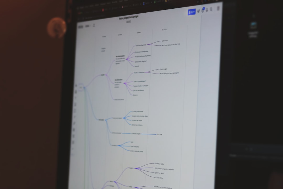
Image not found in postmetaKeep it neat. Keep it centered. Think of it as the trunk of a tree.
Step 2: Add the Root Directory
Most FTP servers have a root directory. Sometimes it is shown as /. Sometimes as public_html or www.
Add a folder shape below the server.
Label it something like:
/ (Root Directory)
Connect the server to this folder using a straight line. No arrows needed if you are just showing structure.
Now you have a clear hierarchy:
- Server
- Root
Simple. Clean. Logical.
Step 3: Build the Folder Structure
This is where things get interesting.
Let’s say your full file path is:
/public_html/assets/images/logo.png
Now you create subfolders under the root:
- public_html
- assets
- images
Each folder should be:
- Placed under its parent folder
- Connected with a line
- Clearly labeled
It should look like a vertical tree.
This makes the structure obvious. Even a non-technical person can follow it.
Step 4: Add the File at the End
Files are not folders. So they should look different.
Use:
- A document icon
- A rectangle with a folded corner
- A different color
Label it clearly:
logo.png
Connect it to the images folder.
Now your Lucidchart diagram visually represents:
ftp://example.com/public_html/assets/images/logo.png
Without writing a single long string of text.
Use Naming Conventions That Make Sense
Clarity is everything.
Follow these tips:
- Use consistent capitalization
- Avoid long labels
- Match folder names exactly to real ones
- If needed, add the full path in smaller italic text
Example:
Full path: /public_html/assets/images/logo.png
This helps developers verify accuracy.
Show Access Flow (Optional but Helpful)
Sometimes you want to show how a user or system reaches the file.
In that case:
- Add a user icon
- Draw an arrow to the server
- Show the path downward
This is great for:
- Training documents
- Security planning
- Website architecture explanations
Now your diagram tells a story. Not just a structure.
Use Colors to Make It Fun
Color makes diagrams less scary.
You could use:
- Blue for server
- Yellow for folders
- Green for files
- Red for restricted areas
This makes scanning easy.
But do not overdo it. Too many colors create chaos.
When to Use a Flowchart Instead
Sometimes you are not just showing location. You are showing a process.
Example:
- File uploaded to FTP
- Server processes file
- File moves to archive folder
In that case, use:
- Flowchart shapes
- Directional arrows
- Decision diamonds if needed
This shifts the focus from where to what happens.
Best Lucidchart Shapes for FTP Representation
Here are some shapes that work really well:
- Cloud: Represents remote server
- Rack server icon: Represents physical server
- Folder icon: Directories
- Document icon: Files
- Arrow connectors: Access or movement
If you keep shapes consistent, your audience understands instantly.
How to Represent Permissions
FTP often involves permissions.
Some folders may be:
- Read-only
- Write-enabled
- Private
You can represent this by:
- Adding small lock icons
- Using dashed borders
- Adding small text like RW or R
This is helpful in team documentation.
Common Mistakes to Avoid
Let’s save you from messy diagrams.
Avoid these pitfalls:
- Putting too many folders on one horizontal line
- Using inconsistent naming
- Not labeling the server clearly
- Mixing process arrows with structure lines
Remember. Structure diagrams are like family trees. Clean branches. Clear relationships.
Advanced Tip: Represent Multiple Environments
Sometimes you have:
- Development FTP
- Staging FTP
- Production FTP
You can create three columns.
Each column gets:
- Its own server icon
- Its own folder hierarchy
Color-code them slightly differently.
Now comparisons become very easy.
How to Explain an FTP Location to Non-Tech People
Use a simple metaphor in your Lucidchart label.
For example:
“Think of this like a warehouse. The server is the building. Folders are rooms. Files are boxes.”
When people understand the metaphor, they understand the diagram.
Create a Legend Section
If your diagram is large, add a small legend box in the corner.
Example legend:
- Blue cloud = FTP Server
- Yellow folder = Directory
- Green document = File
- Red outline = Restricted Access
This makes your chart feel professional.
Exporting and Sharing Your Diagram
Once finished, export your Lucidchart diagram as:
- PNG for quick sharing
- PDF for documentation
- SVG for scalable design use
You can also embed it directly in technical documents.
That makes onboarding new team members much easier.
Why Visual FTP Mapping Matters
Text paths are easy to mistype.
Visual maps are easy to follow.
A clean Lucidchart FTP diagram helps with:
- Troubleshooting
- Website migrations
- Security reviews
- Documentation
- Training
Instead of asking, “Where is that file again?”
You can just point to the diagram.
Final Thoughts
Representing an FTP file location in Lucidchart is not complicated.
It is about structure. Clarity. Simplicity.
Start with the server. Add root. Build folders. Finish with the file.
Use consistent shapes. Clean connectors. Smart labels.
Add color carefully. Add icons for clarity. Add a legend for polish.
In the end, your goal is simple.
Make the invisible folder path visible.
And once you do that, FTP stops being confusing.
It becomes just another easy-to-read map.