Let’s explore some of the most frequently asked questions about Google Charts Alternative. Data visualization is integral to the cause of small scale and large scale industries alike.
They help streamline your planning process and enhance productivity by projecting statistics and results. These include employee performance reports and key company insights. It is the best way of communicating when your data is enormous.
Data visualization tools make it easy to examine and comprehend trends, outliers, and patterns in data by employing visual components like charts, graphs, and maps. You need a capable and credible data charting or graphing library to provide your business with a much-needed boost.
Once you’ve decided to hunt for a graphing library, you’ll find a range of possibilities, from startups to Google’s Charts. Although it works well, it lacks a few essential aspects that can help you improve your profile, so experts are seeking a Google Charts Alternative.
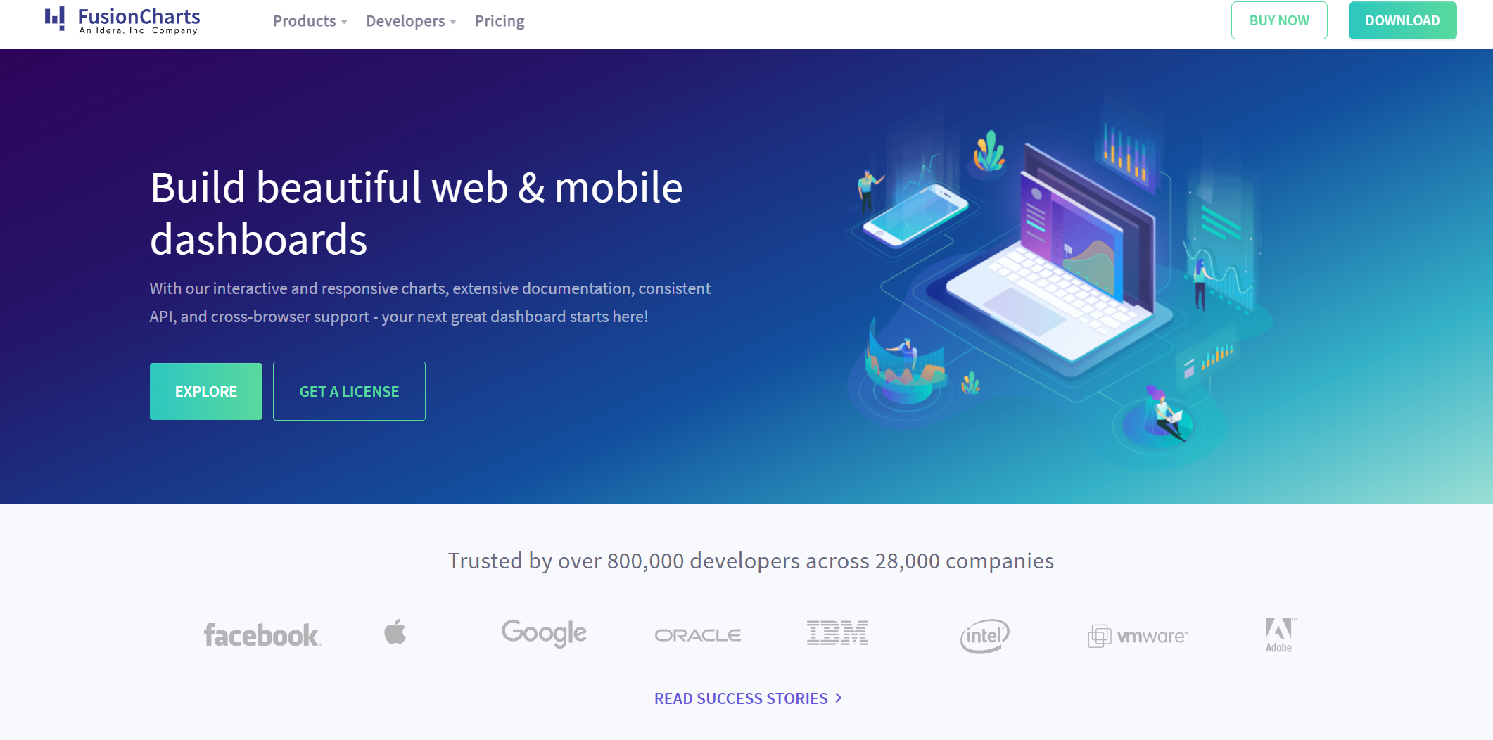
If you’re one of those folks, you’re in luck! We will talk about why switching from your existing graphing library to FusionCharts is a game-changer.
Continue reading to learn more about Google Charts Alternatives and get answers to some of the most frequently asked questions.
What Are Some FAQs Regarding FusionCharts, the Leading Google Chart Alternative
Before we get started with why FusionCharts is the ideal Google Charts Alternative, we will first answer some FAQs regarding it and other graphing libraries in general, which will help you formulate your decision on your following data visualization framework.
Is Visual Rendering Integral to Your Organization
The outputs of your data visualization framework are one of the most important things to keep an eye on. The graphical and tabular representations must complement your design while also visually appealing to attract user attention.
Achieving the right balance between the two will result in a stunning outcome. This detailed tweaking of the ideal rendering depending on your data’s actual type and behavior is critical.
FusionCharts is ideal for this task! It allows you to modify the data and graphing methods entirely and makes the visualization process easier.
You can choose from thousands of pre-built interactive charts and maps to present your data, even in the form of a small dataset or in gigantic data collections. With FusionCharts, you can rest assured that you will visualize your company insights, and your ideas will come across ideally.
Why is Diversity a Key Component in Charts with a Google Chart Alternative
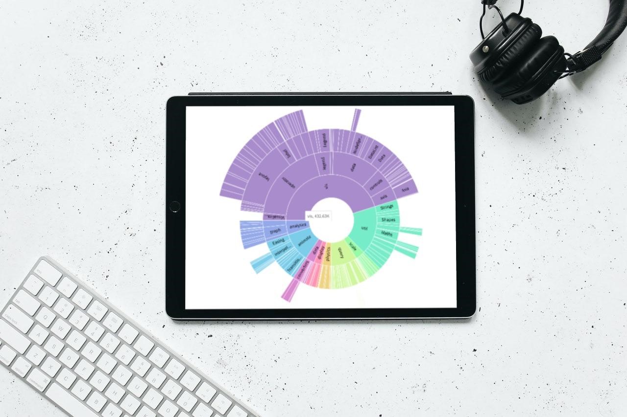
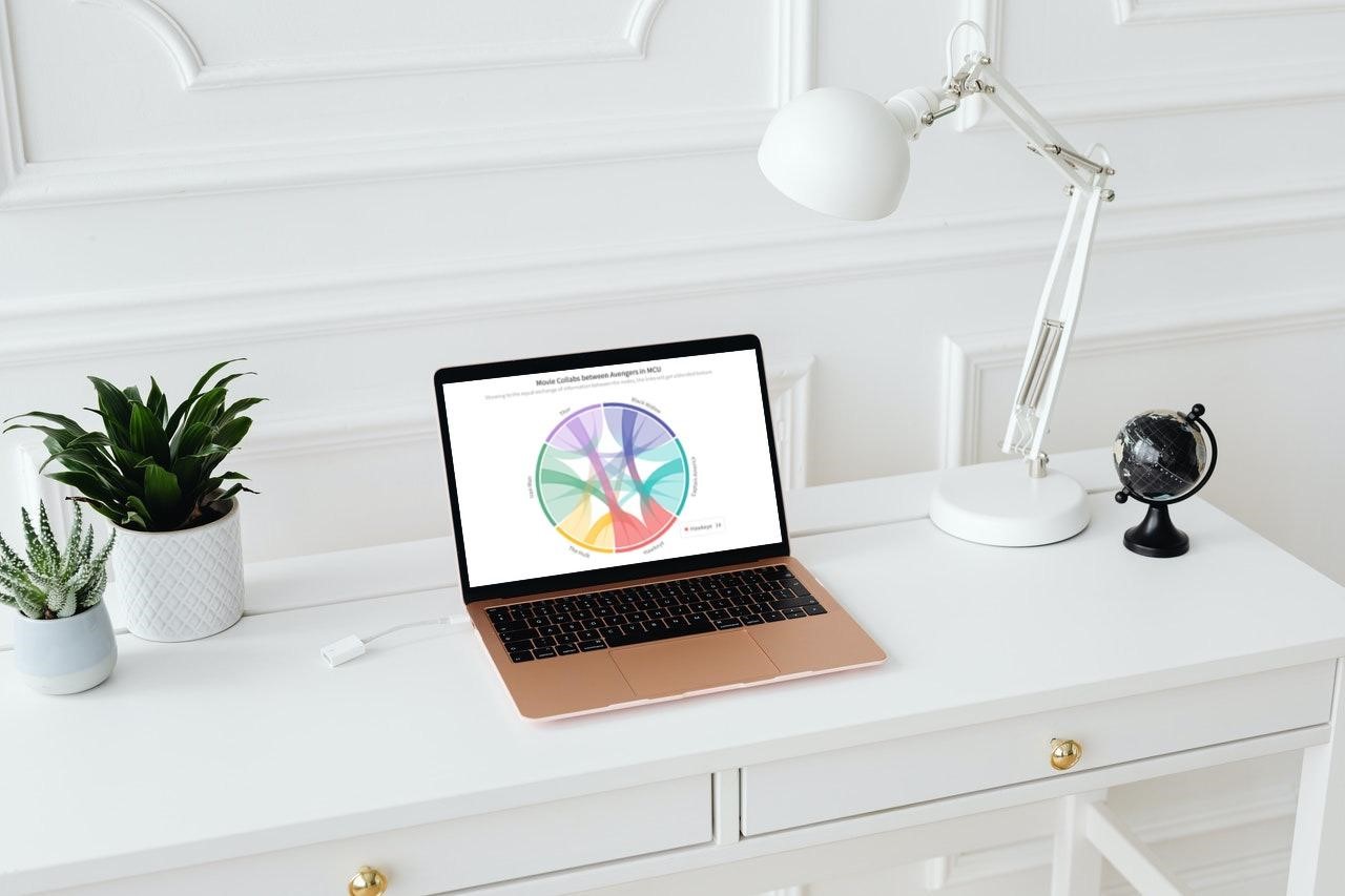
Variety is one of the most important aspects of good data visualization. You should have a large selection of templates and charts at your disposal, so you may pick one that best suits your needs. FusionCharts is unrivaled in this area, with over 2000 choropleth maps and over 100 charts, graphs, and gauges.
Your data will be highly interactive and aesthetically appealing to the audience if you include a bar, column, or pie chart. FusionCharts also includes domain-specific charts like treemaps and Gantt charts.
How Does Extensive Documentation Enhance Client Retention
Let’s face it, we all make errors when we’re in a hurry. The most aggravating part is when you hit a roadblock and are stranded, with deadlines looming and threatening to overwhelm you.
Documentation is essential since it aids in the retention and happiness of clients. When users begin diagnosing and resolving problems, it saves money on labor and increases the company’s credibility in the industry.
The lack of proper documentation is a significant issue that FusionCharts excels at resolving. FusionCharts offers a multitude of tutorials as well as detailed API documentation.
From React to .NET, there are detailed demos of all APIs and sample code for all frameworks. In the framework of your choosing, you may execute the example code for any sort of chart, graph, gauge, or map.
What Are FusionCharts Live Dashboards
It might be intimidating for consumers to come face to face with a slew of previously unknown features. FusionCharts has done what no other Google Charts Alternative has done in this regard: it provides live dashboards as examples.
It includes over 20 live dashboards built in a variety of frameworks and their source code, which is available for anybody to download and study.
This feature is helpful since it allows you to quickly explore all FusionCharts live examples and select the one that best fits your data. You can then fine-tune the code to meet your specific requirements.
How Do Stunning Animations Contribute to a Modern Aesthetic

In this age of social marketing, a modern feel and aesthetic are essential because a product is rated on its visual attractiveness more than its utility.
FusionCharts not only has dashboards to give your data a modern, clean style, but you can also select from pre-built themes or create your own.
The animations are simple to create and provide a more pleasing visual experience. You will seldom need to customize on your own due to the abundance of default configurations in place.
How Does Freedom of Framework Lead to a Low Learning Curve
Frameworks may be a big issue when working with a large amount of data. The bulk of Google Chart Alternatives only has a few frameworks, which might be problematic.
On the other hand, Fusion Charts supports a wide range of frameworks, including React and Ruby, as well as CDN and NPM, on both the back and front ends. This implies that you can make charts in 15 minutes, thanks to the availability of a standard API.
You’ll find ready-to-use chart examples, industry-specific dashboards, and even data stories, all with source code so you can get started right away. Intelligent defaults are another added feature that enables you to get started with deep configuration for each chart element.
Why Does Active Technical Support and Pricing Increase Customer Satisfaction

Lack of proper technical support is one of the industry’s major issues. If a user gets stuck or needs an explanation of a policy or function, help is critical. We all know that a frustrated customer is not a happy client.
You won’t have to worry about anything after FusionCharts is installed because you’ll get world-class assistance to help you present your data.
Furthermore, the pricing offers excellent value for money and the ability to adapt or make plans flexible to accommodate varying team sizes and use. This adds a lot to the experience and makes it much more enjoyable.
Why Will Users Find FusionCharts to Be a Functionally Superior Google Charts Alternative
If you have to opt for a Google Charts Alternative, there is no better option than FusionCharts. This is because it provides tremendous value for money and a vast array of covetable features that are a total game-changer.
It is a stunning data visualization library that always puts customers’ preferences to their utmost priority. It is ridiculously simple to use and make beautiful presentations due to the presence of APIs. Let’s face it you deserve excellence, not mediocrity.
For that reason, FusionCharts should be your choice for the following data visualization library because it has various installation options available (direct JavaScript, CDN, NPM) and is pre-integrated with all popular JavaScript libraries and back-end programming languages along with extensive documentation to help you in times of malfunction or system errors.