Why should you care about the images you use on your website? Does it matter which one you pick, or is there any benefit in being picky? Well, or not, but it’s a big YES. It is scientifically proven that a part of our brain that processes images control decision-making.
Now you might wonder what that has to do with a landing page and images you choose. Picking the best images carefully will not only make your landing page stand out by its design, but it will play the deciding factor in converting visitors into your customers. Building a landing page for your product might seem a piece of cake and a straightforward process, but in reality, it’s not.
You should specially dedicate some time to research for choosing professional stock images for your website. The better your pictures are, the more conversion you will get in total. Images are not the only thing that will help your website. Hosting plays a big part too. So, if you are looking for reliable and affordable WordPress hosting, look no further. WPMU DEV is fast becoming one of the best choices on the web. Get 20% off any of their fully-managed and dedicated plans.
In this article, I will give you five quick tips on improving your landing page by choosing the best images.
Tip #1 – Focus on Emotions and Diversity

You need to play with people’s emotions by choosing images related to the product you are selling. Images should reflect that your product is something they did not hear of before, and you should make visitors believe that their lives will indeed improve if they buy your product.
The other possible scenario is if you choose images that emotionally engage visitors and make them realize that your product is much better and more effective than other similar products. People like to see images of people belonging to a different race, religious or national groups when it comes to diversity. With this approach, choosing a perfect image can have a strong emotional response from people because they feel accepted and very welcomed to your website.
Tips #2 – Focus on Your Brand
This is something that I believe so many people make mistakes when choosing an image for their landing page. They focused on attractive images, appealing to visitors’ eyes but not on their brand at all. You are not making a PowerPoint presentation or choosing a wallpaper for your laptop.
Thus, you should only select images closely related to your product and brand. Let’s assume you have an online store for selling and distributing food. In this scenario, for a landing page, you should select an image related to food. Your website content and assets should be associated with each other. Picking an attractive, high-res image that has nothing to do with your brand will not give your conversions. Do not repeat this mistake.
Tip #3 – Color, Composition, Contrast, CTA

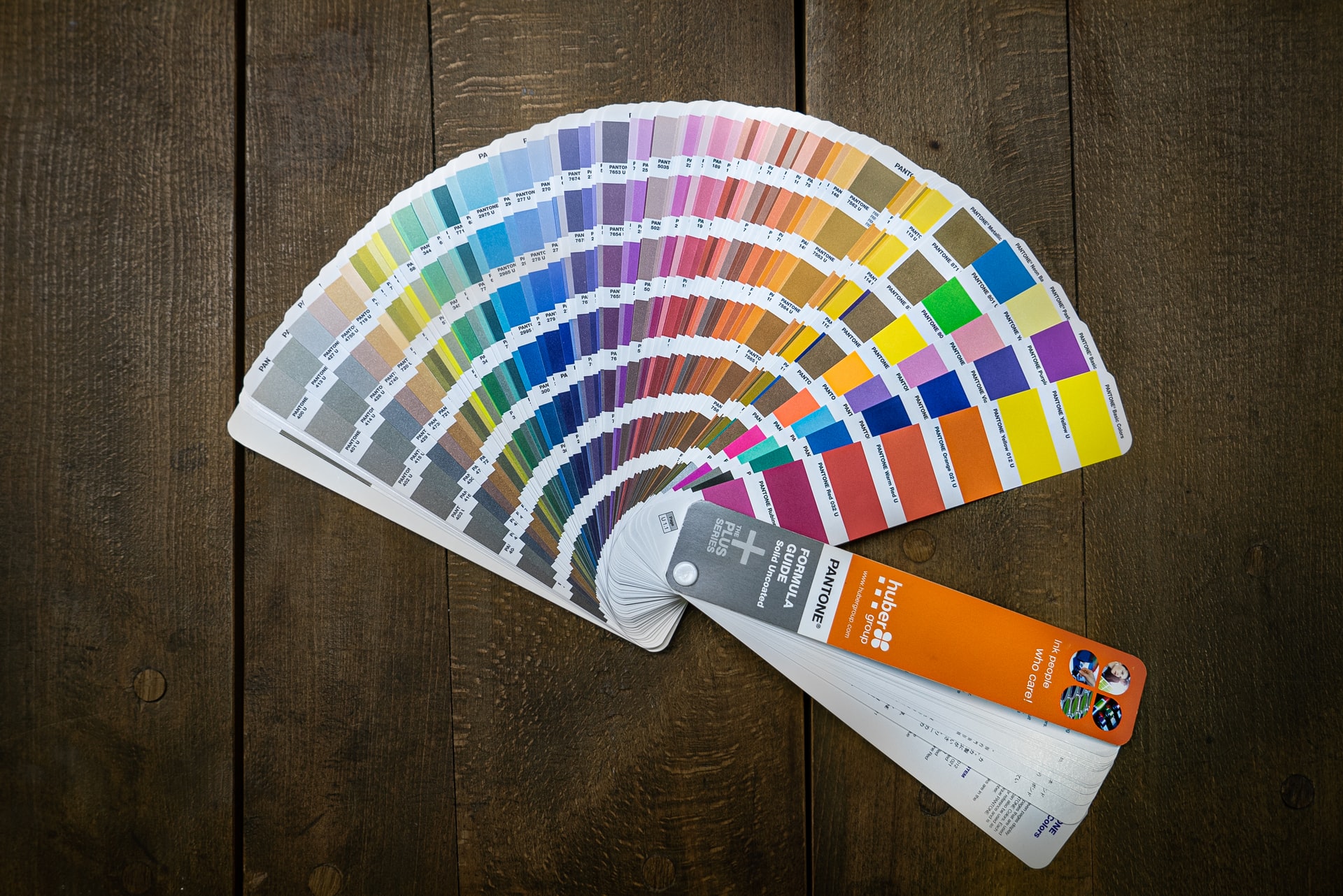
You chose the best image for the landing page, and you are good to go? Not really. Even if you choose the perfect image, you should go through some additional checks before placing it on the landing page. What about colors? Check if the selected image matches your brand’s color scheme.
Of course, they don’t have to reach 100%, but try to choose an image that matches your color scheme as close as you can get. Your landing page should be composed in a coherent way, where each element complements each other and sticks to two or three colors that you picked. You should never have more than two or at maximum three colors in your website design.
There should be a nice contrast between elements, especially on the image you choose for the landing page. The text you place on the image should be evident and well-positioned. The image is not used to look at it and admire it. The image should point and induce visitors to click on a call-to-action button which is the most critical part of the landing page.
Tip #4 – Avoid Distractions (Background Videos or Carousels)
Carousels or dynamic images (videos) are not recommended to use as a part of the landing page because they distract visitors from reading the text or clicking on a button.
People cannot focus on the content of your website if there’s a video playing in the background or moving images. If you skip this step and risk placing a video or a carousel on the landing page, you might be losing a lot of potential conversions.
Tip #5 – Mobile Optimization

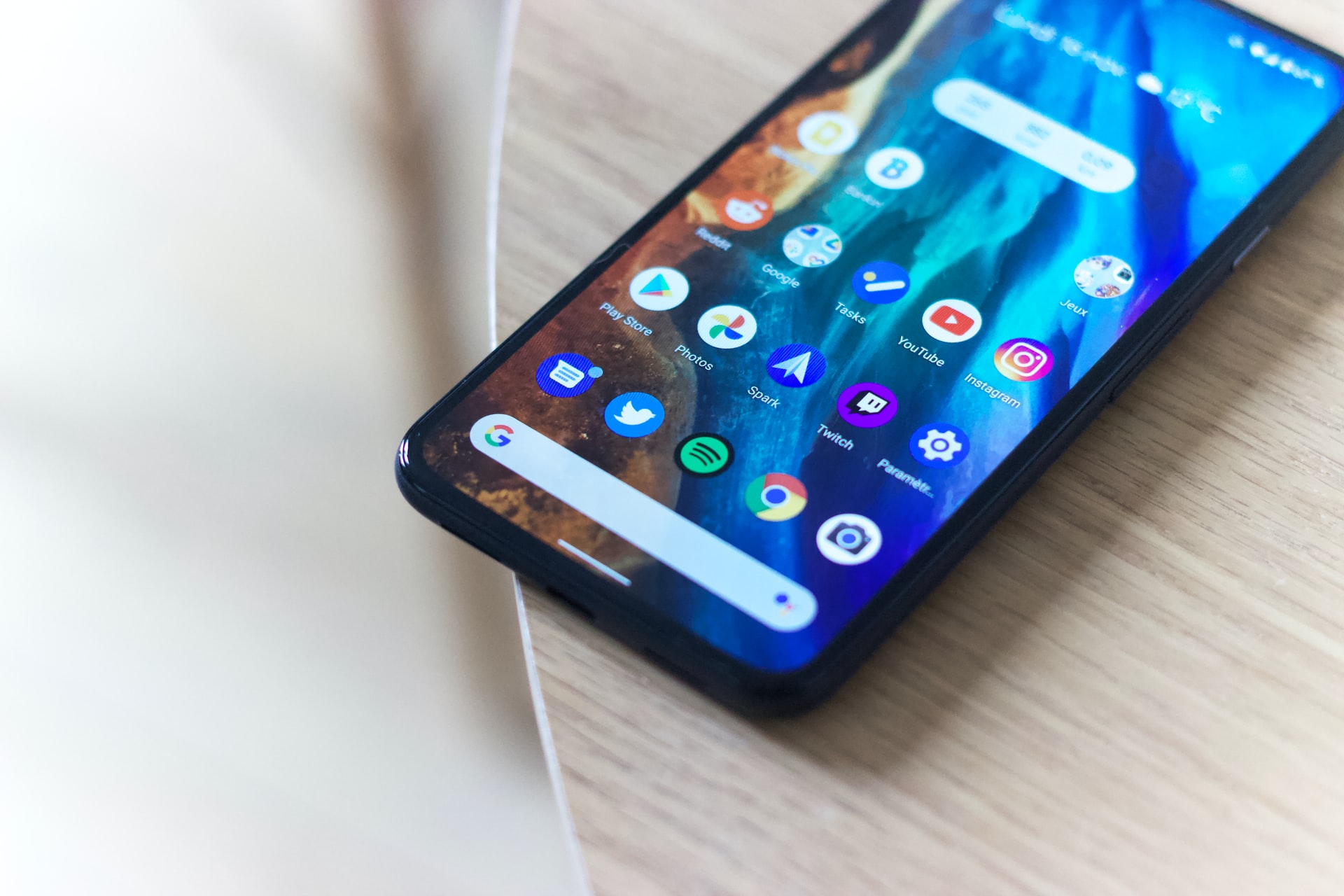
Statistics say that almost 50% of all traffic comes from mobile phones. The more web technology goes forwards, the more it leans towards mobile phones. People are busy, and they use mobile phones for pretty much everything. These stats are enough for you to check carefully how your images are displayed on these smaller-sized devices.
It’s not enough to only optimize them for desktops, but also you should adapt them for mobile phones. Images tend to be stretched, cropped, losing aspect ratio, and sometimes overflowing the web page. You need to take care of it and optimize them to convey the same message as on larger screen devices.

