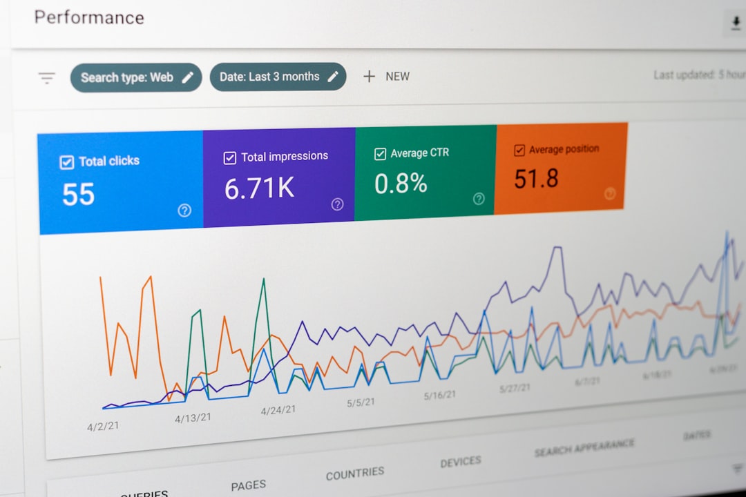
Modern organizations generate massive amounts of data every day, but raw numbers alone rarely deliver value. What truly makes data powerful is the ability to interpret, visualize, and act on it. Data visualization software like Looker empowers teams to transform complex datasets into interactive dashboards, insightful charts, and accessible reports that drive smarter decisions across departments.
TLDR: Data visualization tools like Looker help businesses explore, analyze, and share data through interactive dashboards and intuitive interfaces. These platforms reduce technical barriers, making data accessible to both analysts and non-technical users. Popular alternatives include Tableau, Power BI, Qlik, Sisense, and Looker Studio, each offering unique strengths. Choosing the right tool depends on data sources, team skills, scalability needs, and budget.
Why Data Visualization Software Matters
Data visualization software simplifies complex information by converting numbers into visual formats such as graphs, heatmaps, and dashboards. Humans process visuals significantly faster than plain text or spreadsheets, making visualization tools essential for quick understanding.
Organizations use these tools to:
- Reveal trends and patterns hidden in large datasets
- Track key performance indicators (KPIs) in real time
- Identify anomalies before they become problems
- Share insights across teams in a user-friendly way
- Support data-driven decision-making at every level
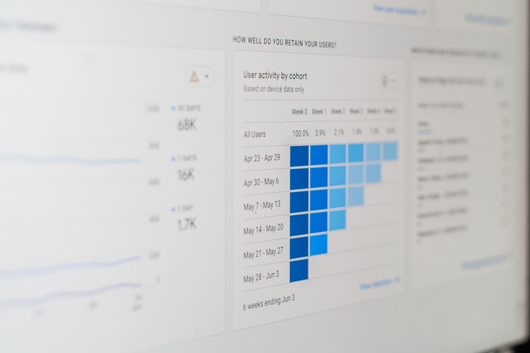
Platforms like Looker are especially valued for their ability to connect directly to cloud databases and provide a centralized analytics environment that keeps data consistent and trustworthy.

What Makes Looker Stand Out?
Looker is known for its robust modeling layer and cloud-native architecture. Unlike traditional tools that rely on static extracts, Looker connects directly to databases, ensuring users always access up-to-date information.
Key features include:
- Centralized data modeling for consistent metrics
- Interactive dashboards with drill-down capabilities
- Embedded analytics for applications and websites
- Collaboration tools for teams
- Cloud scalability for growing organizations
This makes Looker particularly useful for companies that rely heavily on cloud data warehouses and need customizable analytics experiences.
Popular Data Visualization Tools Similar to Looker
While Looker is powerful, it is not the only solution available. Several other data visualization platforms provide similar capabilities, each catering to different business needs.
1. Tableau
Tableau is widely recognized for its highly interactive visualizations and intuitive drag-and-drop interface. It allows users to explore data with minimal coding and connects to numerous data sources.
2. Microsoft Power BI
Power BI offers tight integration with Microsoft products and is often favored by businesses already using tools such as Excel and Azure. It provides strong reporting features at a competitive price point.
3. Qlik
Qlik stands out for its associative data model, which enables users to explore relationships between datasets freely. It encourages dynamic discovery without predefined query paths.
4. Sisense
Sisense focuses on scalability and embedded analytics. It is well-suited for organizations that want to integrate dashboards directly into their software products.
5. Looker Studio
Formerly known as Data Studio, Looker Studio provides a user-friendly, web-based reporting experience. It is especially popular among marketing teams for campaign and web analytics reporting.
Comparison Chart of Leading Data Visualization Tools
| Tool | Best For | Ease of Use | Data Modeling | Pricing Level |
|---|---|---|---|---|
| Looker | Cloud-based enterprises | Moderate | Advanced modeling layer | Premium |
| Tableau | Visual exploration | High | Strong but separate | High |
| Power BI | Microsoft ecosystems | High | Integrated | Affordable |
| Qlik | Associative analysis | Moderate | Flexible | Mid-range |
| Sisense | Embedded analytics | Moderate | Customizable | Mid to high |
| Looker Studio | Marketing reporting | Very high | Basic | Free to low |
Key Features to Look for in Data Visualization Software
When selecting a platform similar to Looker, organizations should evaluate several critical features.
1. Data Connectivity
The tool should connect seamlessly to databases, cloud warehouses, APIs, and third-party services. Broader integration options increase flexibility and future-proof investments.
2. User Interface
An intuitive interface lowers adoption barriers. Drag-and-drop builders, customizable dashboards, and clear navigation significantly enhance usability.
3. Real-Time Analytics
For fast-paced industries, real-time data updates are essential. Direct database connections ensure decisions rely on current information.
4. Collaboration Capabilities
Sharing dashboards, commenting, and scheduling automated reports improve teamwork and transparency.
5. Security and Governance
Role-based permissions, audit logs, and data encryption protect sensitive information while ensuring compliance with regulations.
Benefits of Using Tools Like Looker
Adopting modern data visualization software delivers measurable advantages.
- Improved Decision Accuracy: Visual insights reduce guesswork.
- Faster Reporting: Automated dashboards save hours of manual compilation.
- Greater Transparency: Shared metrics align teams around the same data.
- Scalability: Cloud-based platforms grow alongside the business.
- Enhanced Customer Insights: Marketing and product teams can track user behavior effectively.
By democratizing access to analytics, these platforms enable non-technical stakeholders to participate in strategic discussions with confidence.

Industries That Benefit Most
Virtually every sector benefits from data visualization software, but some industries rely on it more heavily:
- Finance: Risk assessment, forecasting, fraud detection
- Healthcare: Patient data monitoring, operational efficiency
- Retail: Sales tracking, inventory management, customer segmentation
- Marketing: Campaign performance, conversion analysis
- Technology: Product usage insights, system performance monitoring
In each case, the ability to quickly identify trends and outliers provides a competitive advantage.
Challenges to Consider
Despite their benefits, these tools come with potential challenges:
- Learning Curve: Advanced features may require training.
- Cost: Enterprise-level solutions can be expensive.
- Data Preparation: Clean, structured data is essential for accurate results.
- Performance Constraints: Large datasets may require optimized infrastructure.
Organizations that plan carefully, invest in training, and establish governance policies can overcome these hurdles effectively.
How to Choose the Right Tool
Selecting the best data visualization software involves evaluating organizational goals, technical capabilities, and long-term growth plans.
Decision-makers should ask:
- What data sources need integration?
- Who will use the platform—analysts, executives, or both?
- Is advanced modeling required?
- What is the budget?
- Does the solution scale with projected growth?
Piloting multiple tools through trials can provide practical insight before committing to a full deployment.
The Future of Data Visualization
Emerging technologies such as artificial intelligence and machine learning are reshaping data visualization. Modern platforms increasingly include automated insights, predictive analytics, and natural language querying.
Users can type a question like “What were last quarter’s top-performing regions?” and receive instant visual answers. As automation expands, the gap between technical analysts and business users will continue to narrow.
Data storytelling—combining visuals with narrative context—is also becoming more prominent. Instead of presenting isolated charts, organizations are building cohesive stories that guide stakeholders through insights step by step.
Conclusion
Data visualization software like Looker empowers organizations to transform data into actionable intelligence. With intuitive dashboards, scalable cloud integration, and strong collaboration features, these platforms simplify complex analytics tasks. While alternatives such as Tableau, Power BI, Qlik, Sisense, and Looker Studio offer unique strengths, the core objective remains the same: making data accessible, understandable, and useful.
In an era where data drives competitive advantage, investing in the right visualization tool can significantly enhance strategic clarity and operational efficiency.
Frequently Asked Questions (FAQ)
1. What is data visualization software?
Data visualization software transforms raw data into graphical formats such as charts, dashboards, and reports, making complex information easier to interpret and analyze.
2. How is Looker different from other BI tools?
Looker emphasizes centralized data modeling and direct database connections, ensuring consistent metrics and real-time insights across the organization.
3. Is data visualization software suitable for small businesses?
Yes. Many tools offer scalable pricing plans or free versions that allow small businesses to benefit from analytics without large upfront investments.
4. Do users need coding skills to use these platforms?
Most modern tools feature drag-and-drop interfaces designed for non-technical users. However, advanced customization may require some technical knowledge.
5. What factors should companies consider before choosing a tool?
Companies should evaluate integration capabilities, ease of use, scalability, security features, and total cost of ownership before making a decision.
6. Can these tools handle real-time data?
Many enterprise-grade platforms, including Looker and Power BI, support real-time or near real-time data connections, depending on infrastructure setup.