First of all, before we try to find a better way to get more newsletter signups, it is essential to clarify what a newsletter is and why you would even use it on your website. So, a newsletter is a way of communication between you and your subscribers or customers daily.
If you have special discounts, new offers, and products you want to inform your subscribers about, this is a perfect way. The newsletter is sent through email, but you need to grab their emails before that. It is claimed that the best way you can induce your subscribers to give you their emails and subscribe to your newsletter is through an engaging and attractive landing page.
If you design landing pages and create websites, keep on reading. WPMU DEV’s all-in-one platform makes it easy for anyone to create, manage, and sell websites. Get 20% off any of their plans. Free trial included.
So, paying close attention to details when building a landing page is crucial for getting more signups and potential conversions. However, statistics say that social media followers are not more efficient than newsletter signups. Newsletter subscribers are more likely to become new customers than social media followers.

Moreover, every newsletter box consists of a few elements: a catchy headline, short description, and CTA button. The headline should not be longer than a few words. The longer it is, the fewer chances are to get conversions, including the description, which should not go over two or three sentences at best.
In addition, do not go into too much detail. Try to be clear and direct enough. You need to pay attention to where you should place and position the headline and the description. Change boring and default text fonts; go with something refreshing and unique, but still catchy and not too crazy.
The whole idea behind having a newsletter box on your website is to “force” visitors to click on the signup button and subscribe. When you get their emails, you can easily send them promotional emails. The newsletter becomes your powerful tool for communicating with your subscribers and informing them about your product or something you are selling. What topics should you cover, and how often should you send the newsletter? It depends on what your niche is.
How to Increase the Chances of Getting More Newsletter Signups
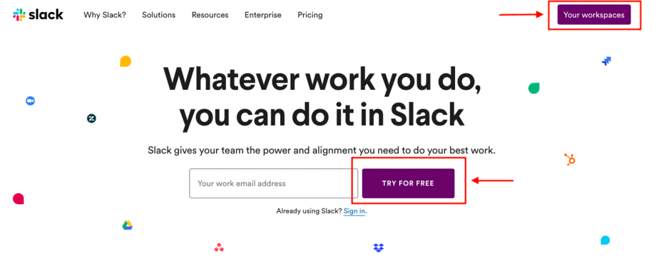
Never use boring and barely visible CTA buttons. You can improve that with creative colors and font selection with a bit of contrast between the text and background image. The CTA button should be in focus, leaving the visitor no option but to click on it due to its appealing and attractive look. Let’s take a look at some examples of great CTA buttons.
See how Slack’s landing page hero section is clean and simple yet powerful and catchy. With a concise and clear headline, description, and enough big CTA buttons, you feel that you should enter your email and try their service for free.

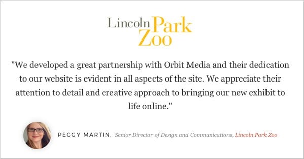
Furthermore, use the power of testimonials and include a few of them. Testimonials should be unique and non-robotic. Do not use phrases like “I like this product” or “This product is handy.” These testimonials are by default useless, and it sounds as if a kid has written them. Be precise, what people get if they subscribe to the newsletter and how often. Here is an example of a well-written and naturally sounding testimonial.

We already figured out how important it is to show the visitors what they will get after signing up for the newsletter, so adding on that, you should think of finding a way to give them access to preview your newsletter. Not only showing them screenshots or explaining them through a written form but let’s go one step further and give them a real-time experience of previewing your newsletter, which is hosted online. Try to be creative and do not copy others. Be unique!
Time, time, and time. We know how important and valuable time is in our lives. Having learned that fact, tell your potential subscribers how much time you will save them if they sign up for the newsletter. How much time will they need to master something, and in what way will you help them through the newsletter – these are the questions you need to answer to them. People also like to know how long your newsletter will be and how much time you will need to read it.

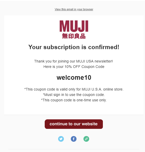
Finally, people like to be surprised, so as a way to thank your subscribers for signing up for the newsletter, you can give them a gift. It does not have to be $1000, but as little as a discount code for purchases, a unique ebook with valuable tips, or something similar will engage them even more.


